In the highly competitive world of e-commerce, a logo is more than just a visual representation of a brand. It’s a powerful tool that can leave a lasting impression on consumers and drive sales.
A well-crafted logo can instantly convey your brand’s essence, values, and personality, building trust and recognition among your target audience.
Table of Contents
On the other hand, a poorly designed logo may confuse customers, appear unprofessional, and ultimately drive away potential clients. As an e-commerce business owner or marketer, understanding the key elements that make a logo effective is crucial for success.
Building the right e-commerce logo can create a visually striking and memorable brand identity that resonates with your audience and sets you apart from the competition.

1. Memorability: The Mark of a Strong Logo
A memorable logo is key to building strong brand recognition. According to research, a skillfully crafted logo can enhance brand recognition by a staggering 80%. When consumers instantly recall and recognize your logo, they feel familiar with your brand and are more likely to buy from you.
To achieve memorability, focus on creating a simple yet unique design that stands out in the minds of your audience. Consider using distinctive shapes, colors, or typography that align with your brand’s personality and values. Remember, simplicity is essential; a cluttered or overly complex logo is hard to recall and can confuse customers.
When crafting an e-commerce logo, it’s essential to consider several key elements to ensure maximum impact and effectiveness in conveying the brand’s identity. Crafting a timeless design ensures your logo stays relevant and effective in representing your brand’s identity in competitive e-commerce markets. A reputable Tampa digital marketing agency can provide valuable insights into these elements.
Case Study: The iconic Amazon logo with its distinctive arrow symbolizing movement and satisfaction, is a prime example of a memorable e-commerce logo. Its simplicity and clever use of negative space make it instantly recognizable, contributing to the brand’s success and widespread recognition.

2. Scalability: Preparing for Various Media
In today’s digital world, your logo must be versatile and adaptable across different platforms and mediums. A scalable logo design ensures that your brand’s visual identity remains consistent and recognizable, whether it’s displayed on a website, social media platform, or physical product packaging.
To achieve scalability, consider creating your logo in a vector format, which allows for resizing without compromising quality. Additionally, minimizing intricate details and opting for a simpler design can ensure that your logo remains legible and visually appealing at different sizes.
Example: The FedEx logo exemplifies scalability. It maintains its integrity and legibility across various mediums, from shipping boxes and trucks to digital platforms and advertisements, ensuring consistent brand recognition for the digital marketing company.
3. Color Psychology: Influencing Shopper Behavior
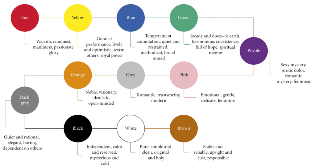
Colors can evoke emotions and significantly influence consumer behavior and purchasing decisions. By carefully selecting the right color palette for your logo, you can tap into the psychology of color and create a powerful emotional connection with your target audience.

Warm colors like red and orange suggest energy, excitement, and urgency, making them suitable for e-commerce brands targeting impulse buyers or promoting discounts. Conversely, blue and green convey trust, reliability, and calmness, appealing to customers looking for quality and stability.
Analysis: The vibrant green hue in the Whole Foods Market logo effectively communicates the brand’s focus on natural and organic products, while the playful cursive typography adds a touch of warmth and approachability.
4. Simplicity: Clarity in Design
Simplicity is key to effective logo design. A simple logo is easier to remember, reproduce, and recognize across different platforms and mediums. According to statistics, 95% of the world’s most iconic brands have chosen simplicity in their logo designs.
When designing a simple logo, focus on conveying your brand’s core message and values through clean lines, minimalistic shapes, and limited color palettes. Steer clear of unnecessary elements that could clutter your design and reduce its impact.
Contrasting Example: Apple’s iconic logo, with its simple silhouette of an apple and a carefully chosen color palette, exemplifies the power of simplicity. In contrast, some lesser-known e-commerce brands have logos that are overly complicated, making them difficult to recognize and remember.
5. Brand Consistency: Aligning Logo with Brand Identity
Your logo represents your brand’s identity and should align with your overall message, values, and personality. Consistency in style, fonts, and messaging across all touchpoints is crucial for building a strong and recognizable brand presence.
Working with a reputable digital marketing agency can provide valuable insights and strategies for this. When designing your logo, consider how it will integrate with your brand’s existing visual elements such as website design, product packaging, and marketing materials. Ensuring consistency across these touchpoints will create a cohesive and professional brand experience for your customers.
Example: Nike’s iconic “Swoosh” logo is a testament to brand consistency. The simple yet powerful design seamlessly integrates with the brand’s overall aesthetic, reinforcing its message of athleticism, movement, and innovation across all touchpoints.
6. Versatility: Adaptability Across Platforms
In today’s rapidly evolving digital landscape, your logo should adapt seamlessly to all devices and platforms. Your logo should remain visually consistent and readable on screens of all sizes, providing customers with a unified brand experience.
The path to this dynamic flexibility is normally through well-thought-out responsive logos: they can dynamically change in size to fit perfectly across different screen sizes and resolutions. Responsive logos or context-aware logos are logos that should change their look dynamically, depending on what platform or device they are viewed on but still maintain recognizability.
Example: The eBay logo is a prime example of versatility. It’s simple design and use of negative space allow it to seamlessly adapt to different platforms and screen sizes, ensuring a consistent brand experience for users across various devices.
7. Cultural Relevance: Connecting with Global Audiences
As e-commerce businesses expand globally, it’s essential to consider cultural relevance in logo design. Symbols, colors, and imagery that resonate in one culture may be misinterpreted or offensive in another.
Conducting thorough cultural market research and consulting with experts can help you avoid potential missteps and ensure that your logo resonates with your target audiences across different regions and cultures.
Incorporating digital marketing strategies can extend the logo’s reach and impact, boosting customer engagement and loyalty.
Case Study: Starbucks’ iconic siren logo underwent a redesign in 2011 to remove the wordmark and simplify the design. This change allowed the logo to transcend language barriers and connect with a global audience, contributing to the brand’s successful expansion into international markets.
8. Timelessness: Designing for the Future
While staying relevant is important, an effective logo must possess timeless qualities to endure. Trends may change, but a well-designed logo that represents your brand’s core values can remain relevant for years.
To achieve timelessness, avoid following fleeting design trends and focus on creating a logo that is simple, versatile, and reflective of your brand’s enduring essence. Additionally, consider using classic typography and color combinations that are less likely to become dated over time.
Example: The Coca-Cola logo, with its distinctive script and classic red color, has remained largely unchanged since its inception in 1886. Its timeless design has allowed the brand to maintain its iconic status and global recognition for over a century.
9. Legibility: Ensuring Clear Communication
In the world of e-commerce, your logo needs to communicate your brand’s message clearly and effectively. Legibility is key to ensuring your logo is recognizable and readable across various mediums and contexts.
When creating your logo, focus on typography and iconography. Choose fonts that are clear and easy to read, even at smaller sizes. When using icons or symbols, keep them simple and recognizable, avoiding unnecessary complexity.
Example: The Amazon logo is an excellent example of legibility. The simple wordmark and distinctive arrow symbol are instantly recognizable and easy to read, ensuring clear communication of the brand’s identity and values.
10. Uniqueness: Standing Out in a Competitive Market
In today’s crowded e-commerce space, having a distinctive logo is crucial. Brand recognition is essential. A unique logo should be able to place you in a sea of sameness, making a difference while leaving an impression on your intended audience.
Uniqueness can be achieved with custom typography, unique color combinations, and symbols that resonate with your brand personality. However, there should be a balance between uniqueness and memorability to ensure that your logo is not so abstract or complex that it loses its humanlike quality.
Example: The Airbnb logo, with its distinctive combination of symbols and colors, stands out in the travel and hospitality industry. Its unique design effectively communicates the brand’s focus on connecting people and creating unique experiences, setting it apart from competitors in a visually compelling manner.

E-Commerce Logo FAQs
1. What are the essential components of an e-commerce business model?
The key elements include value proposition, target market, product/service offerings, revenue streams, distribution channels, key resources, key partners, and cost structure.
2. What are the key aspects of e-commerce?
The main elements are an e-commerce website/platform, online payment system, inventory management, order processing and fulfillment, customer service, marketing and promotion, analytics and reporting, and security and privacy.
3. What should you focus on in logo design?
The main elements are simplicity, relevance, versatility, color scheme, typography, symbolism, memorability, and scalability. The goal is a visually appealing, recognizable logo that effectively communicates the brand.


